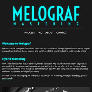
Melograf Site Redesign
 I've just redesigned the site for my mastering service, Melograf Mastering, to make it much more accessible on mobile devices. It's a lightweight html5 site, replacing the previous WordPress and Flash-based incarnation that had nonetheless served me well for the past six years (crazy to think it's six years old already!). I've retained the dark, cyan-heavy style though---if it works, why change it?
Hopefully everything renders just fine, with nippy page loads and responsive resizing for different browsing devices, but if you notice anything afoot, embarrassing typos and the like, please give me a shout. It feels odd to do without WordPress, but it admittedly made less sense on a blog-less site, and was used primarily for the feedback comments and the contact form. Now that it's been established for a while and I have more credits under my belt, the loss of a feedback page is hopefully minimal. It's been almost fun refreshing my basic web dev knowledge, reading up on html5, css3, media queries and the like. For a dilettante like me, these more recent developments certainly seem to have made designing a simple site much more straightforward and browser-compatible. Lo, progress!